Belvenia Project Reveal Part I
- Alyssa Wieske
- May 2, 2023
- 2 min read
Updated: Dec 18, 2024
One of our first projects after starting Coco & Jack was the Oakville remodel. It was such a pleasure working with the homeowners, and we were beyond excited when they asked us back to help them with their new home. Although the house was fairly new and beautifully finished, they were looking for us to help furnish a few room, and design some impactful details that would add interest and character. Although I love the blank slate of a full gut, I equally love the challenge of working with some existing elements and reimagining them.
the foyer afters

In the entry, we painted out the walls White Dove by Benjamin Moore. It’s one of our favourite soft whites to use. (We have a full paint guide coming with all our favourite colours and how to use them!) The large wood console table was a great way to add some warmth against the marble tile. Since there was not enough space to include a bench, we incorporated a small ottoman that can be pulled out for a spot to sit and put on your shoes.
I love the look of the leaning mirror and artwork. It gives the space a more laid back feel.
the office before
The office sits right off the entry. The original room already had some beautiful details that we were able to work off, but overall felt a bit bland.

the office afters
One of the biggest impacts was painting out the walls, trim and fireplace mantel in a deep grey green. I always love how much of a difference this makes! It gave the room a cozy and moody feel. On either side of the mantel we incorporated black metal shelving units which gives the space an extra layer and depth. I also love the simple window pane rug.

We didn’t have a ton of width in the room, so instead of going with a typical coffee table, we used a wood dining bench. Not only was it nice and narrow for the space, but the long length felt really grand.
We flipped the desk to face the window. This helped minimize a glare on a computer screen, and also gave a nicer view when sitting down. The light wood tone of the desk gives some contrast against the deeper tones and also adds a beautiful texture in the room.
The deep brown leather sofa adds to the moody design, and I’m always a fan of linen window treatments.
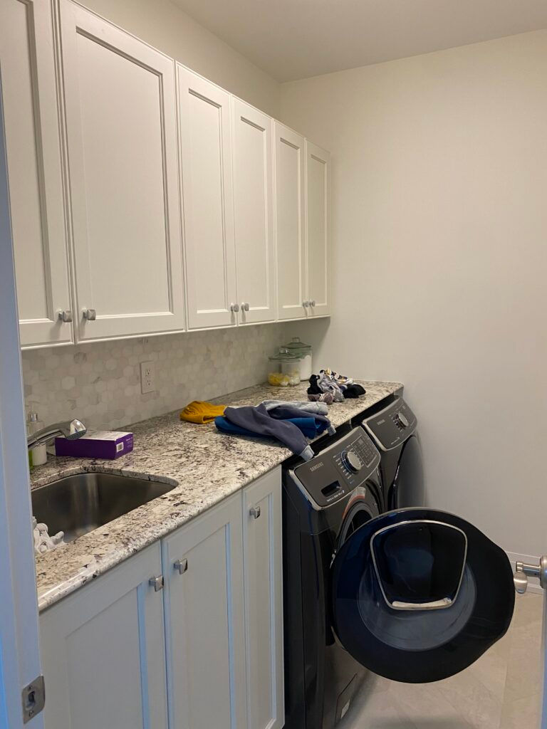
the laundry before
The layout in this room was good, but there was some room for improvement with the millwork. The sink sat too high, and the wall cabinets made the space feel tight.

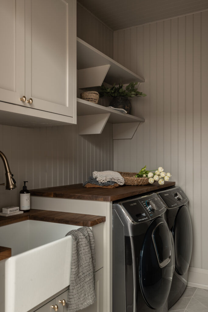
the laundry afters
We lowered the sink cabinet to make it standard counter height, and replaced two of the upper cabinets with open shelving. To add some more character, we had bead board installed on the walls, and ceiling and painted everything out the same colour.


It’s not a huge space, but I love the details added with the butcher block counter, apron front sink and bridge faucet.
Thank you for checking in on this project! I’ll be sharing the second part of the reveal here next week. It includes the kitchen which is my favourite before and after in this home!
-Alyssa


Comments